If you were a good developer all through the past year, perhaps Santa brought you a shiny new iPhone. If he did, you’ve certainly spent hours playing with it – browsing, downloading apps, microblogging, and all in all having lots of fun.
Now, being the web developer that you are, you’re probably wondering where the heck is “View Source,” and how you can create sites and apps that look and work great on the iPhone. Here are some tips and tricks to start you off – and best of all, you can practice on a simulator if you’ve yet to make the big purchase.
1: DOCUMENTATION AND THE IPHONE SIMULATOR
“Documentation: none,” when he started playing with Safari for iPhone – but the situation has changed since then. Apple now makes available as part of the Safari documentation.
The iPhone SDK (software development kit), which is Mac-only, also contains an iPhone simulator – this is very handy if you already own an iPhone, and of course it’s absolutely essential if you’re yet to join the iPhone army. To access it, you’ll need to and install the iPhone SDK. Once you’ve installed it, you’ll find the iPhone simulator in/Developer/Platforms/iPhoneSimulator.platform/Developer/Applications.
2: SMALL SCREEN CSS
The most obvious difference between an iPhone and your PC or Mac is that the iPhone has a much smaller screen. If you already have a page that works in desktop browsers and screen readers, one simple strategy is to have an additional style sheet that’s only used by the iPhone. Here’s the markup you’d use:
This link element uses a to target devices with a maximum width of 480 pixels – that is, the available width when the iPhone is in landscape orientation. are needed for IE version 5.5 or earlier; these versions lack support for the media query and will load the style sheet intended for the iPhone. Let’s try an example.
In we can see a page that will display a red box to iPhone viewers, and a blue one to other viewers. A style sheet, contains styles intended for all browsers, including the declaration for the blue box. Another, is intended for handheld devices and contains the declarations for the red box. When you load this example in an iPhone, you’ll see the red box; on your desktop, you’ll see blue.
If you’d prefer to use only one style sheet, you could add the iPhone-only styles to the main style sheet using an @media block, like so:
@media only screen and (max-device-width: 480px) { #test-block { background: red; } } We can see an example of an inline stylesheet in use in In the stylesheet it uses,, you’ll see the declaration for a red background in an @media block.
3: THE VIEWPORT META ELEMENT
By default, Safari on the iPhone will render your page as if it was a desktop browser on a big screen, with 980 pixels width available for the web content. Then it will scale down the content so that it fits the small screen. As a result, the user sees your page with miniscule, illegible letters and must zoom in to see the interesting parts. This might be okay for your web pages, but if you’re designing a web app that aims to look like a native application, this is unacceptable.
Luckily, this is easy to correct using the special viewport meta element:
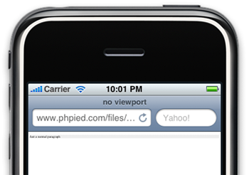
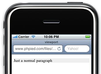
This element instructs the browser to use the width of the device as the width of the viewport, instead of the default 980 pixels. We can see the difference with two examples.
shows a simple paragraph element and no viewportmeta element. The font is almost unreadable. includes the viewport element. Now that the device width is only 320 pixels, the font size is much easier to see. 

Alternatively, you can set a device-width value to any number you like. For example, let’s say your blog has a layout with a fixed width of 750 pixels, so that it fits nicely in an 800×600 desktop screen. shows a stripped-down version of this kind of layout: if you load it in the iPhone, you’ll see white space that fills up the rest of the 980 pixels.
To eliminate the extra space, you can use the viewport meta element and set the width to 780px:
shows a version of our fixed layout with this viewport meta element.
The content of the meta viewport element can also contain multiple comma-delimited values, such asinitial-scale – the zoom level at which the user initially sees your page – as well as whether the interface is user-scalable. For web apps, a common set of values is:
This element sets the width to the maximum device width (as we saw before), zooms into a zoom level of one, and also forbids the user to zoom in and out of the content. That’s handy for web apps that should look and feel like a native application.
引自: